Democratizing entry-level to robotics
Project Overview
Application for remote control of the robotic arm Sixi and intuitively record end perform a sequence of actions. Final deliverable – WebGL application prototype hosted with live camera feed.
Client
Marginally Clever Robots, Ltd. was founded in 2008 and believes in using technology to improve life quality. With this vision, Marginally Clever makes robots that solve everyday problems.
Constraints
- 3 months proof of concept (POC) project.
- Provincial COVID-19 protocols and regulations, the project was completed 100% remotely.
- Sixi’s design limitations, such as limited-communication, lifting power, and rotational speed.
- User tests were conducted remotely.
My Role | UX & UI design
What I actually did:
- UX research
- Facilitated user interviews
- Conducted user tests
- Facilitated design sprints for the team
- Created interactive low and high fidelity prototypes
- Full UI design
- Full product process from research through to shipping
- Documentation
Solution
The team developed a web application that is easily deployable to a wide range of platforms, including mobile. We have incorporated intuitive and user-friendly UI, that allows remote robot control even for hobbyist users.
Design process
Initial Research and Analysis:
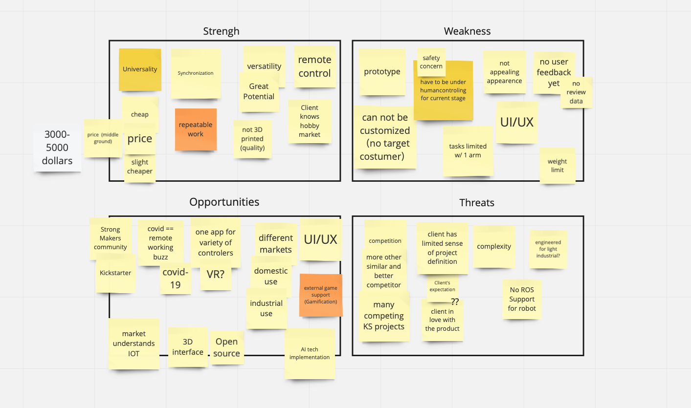
The team began working on the project by focusing on researching related solutions and competition. We found that:
- There are many robotic arms on the market.
- The majority are used in heavy industry.
- A variety of robotic arms are designed for domestic and educational use.
After review, the team found that Sixi robotic arm has a competitive price and would likely be well suited for use in light industrial, educational, and domestic environments.
Project goals
- Create a UI that is intuitive even to non-technical users not familiar with robotics.
- Create a Robot Overlord App version that is easily deployable to a wide range of platforms, including mobile.
- Incorporate user experience and design elements into the UI, so the app presents well and is intuitive to use remotely.
The team created a broad list of possible use cases and researched the various controls required for the given purposes. Web controls were the lowest common denominator for most suggested scenarios. Therefore the team chose to create the iteration for web control first.
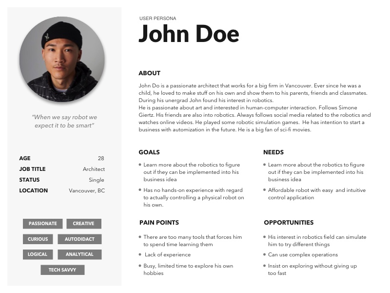
In the current product development stage, the team decided to focus on robot hobbyists as a target audience. Our research results suggested that this category of users has a higher potential to become early adopters.
User Interviews
The team conducted 1:1 interviews with seven robot enthusiasts. Six out of seven users had previous experience operating at least one robot. This was done either as a part of their work, studies, or hobbies.
Most of the users actively follow the field of robotics and enthusiasts in the area such as Youtuber Simone Giertz. All the interviewees were self-taught and acquired a significant part of their knowledge online. They are interested in various robotic arm applications and expressed the desire to explore using the arm with AI applications and to create art. Unsurprisingly, we found that the price is the main barrier to purchasing robots for personal use. Besides, many users mentioned that when interacting with robots, they expect them to be smart. Most of the interviewees said that they thought that robots are powered by AI or other sophisticated software. Also, our interviewees tended to attribute personality to robots.
We organized our interview findings into an empathy map to help understand the needs of the user.
This research helped shape the direction of our project. We decided to create an intuitive user experience and find ways to give the robot a personality through our application.
Design Workshop
To align the full team with the project goals and start the project off on a creative note, we incorporated components of a design sprint early in our development process. This process is an adapted remote version of exercises taught through the Design Sprint Certification Course by Time Factory and the Design Sprint book by Jake Knapp. All the exercise methodologies were adjusted to the remote workshop. We used the Miro application as a primary collaborative tool.
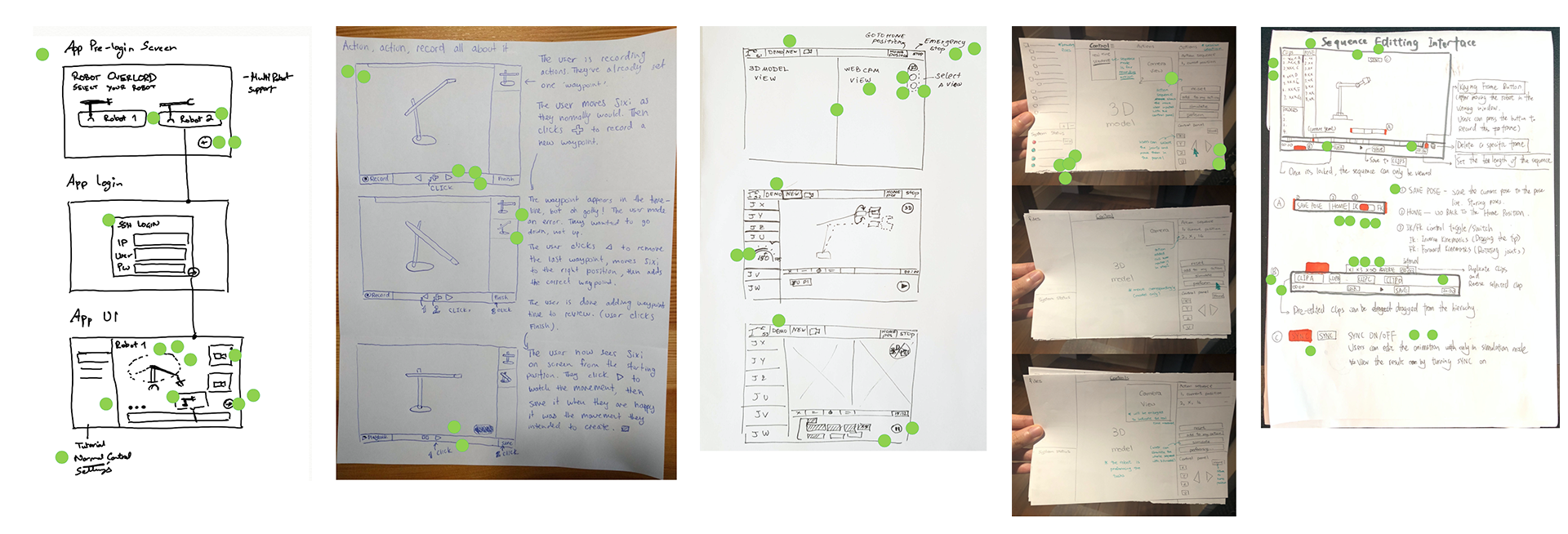
The team worked collaboratively to expand our idea generation and created full sketched prototypes, which provided grounds for our first design iteration. As a result, the team aligned on the goals, the main features of the application, and terminology usage.
Prototyping and testing
First sketches and features served as a base for the design artifacts and the first prototype of the application.
Application Feature and User Experience
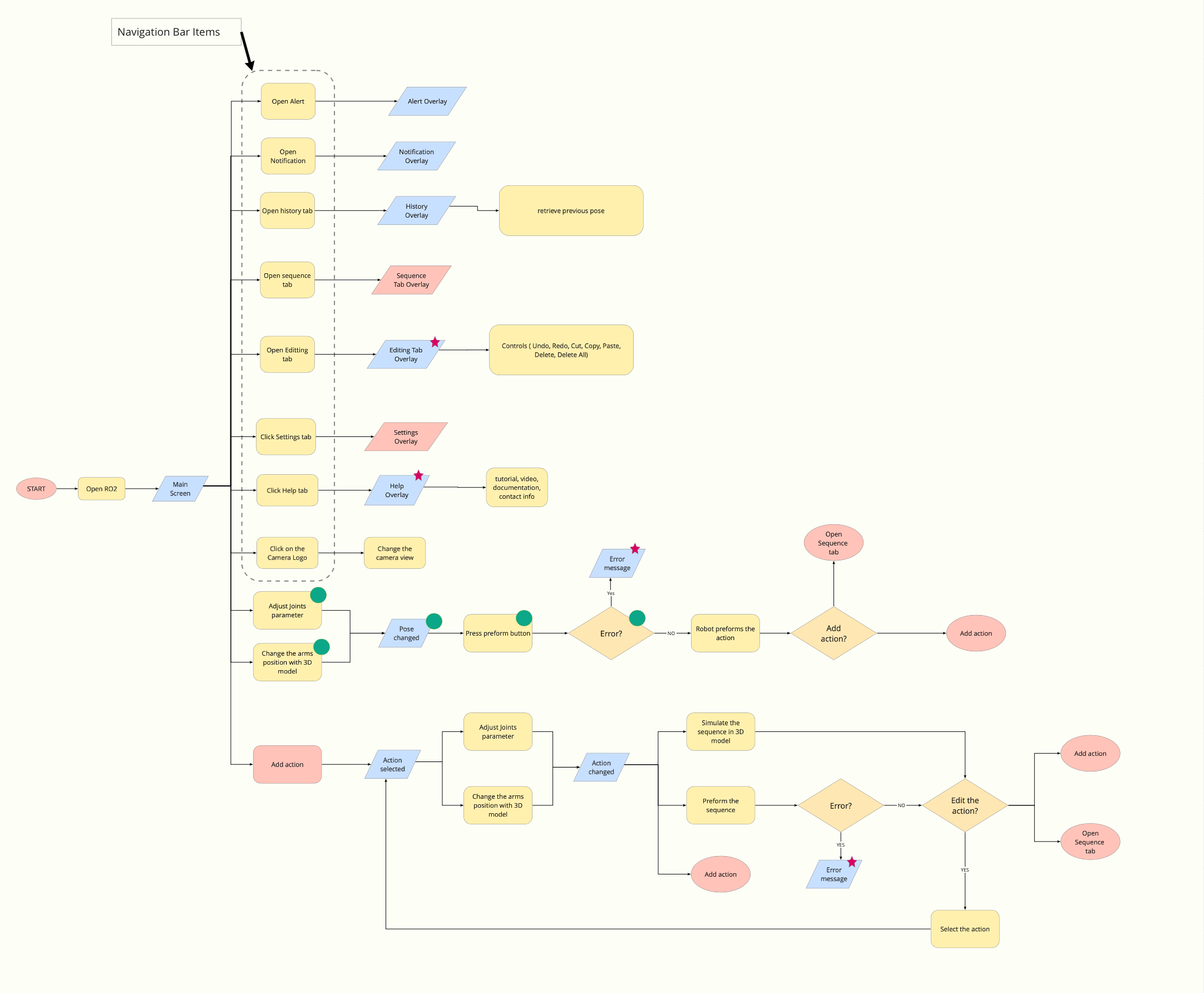
To provide users clarity and ease of use, the team created a minimal interface and used the approach borrowed from familiar video editing applications. We defined robot movements as being comprised of poses. Our design then dealt with sequences of poses and introduced a sequence timeline that was intuitive and functioned similarly to the timeline familiar to the users from other applications.
We applied familiar mental models to simplify users’ actions. For example, the option to save a sequence is positioned in the top left corner, as is common in other applications.
Look and Feel
Our target users are young and tech-savvy. The team decided to follow the dark mode design trend familiar to the users from other applications to increase the visual appeal.
Microcopy
We kept the interface simple, clear, and straightforward. We used in-app notifications to create a sense of communication with the robot and add some personality to the machine. We gave the robot arm a friendly teenage personality and expressed it in helpful and straightforward notifications. The system uses simple English when speaking to the user.
Visual cues
Visibility of system status is a basic usability heuristic we kept in mind throughout all the product design. The user will understand where they are in the app and the current system status. This was achieved by highlighting the active joints and active poses, the shadow model that mimics the movement, web camera feed, and the notifications.
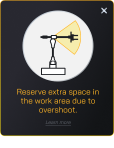
We used illustrations to make the notifications more informative and helpful and leveraged this as an opportunity to pour personality to the robot.
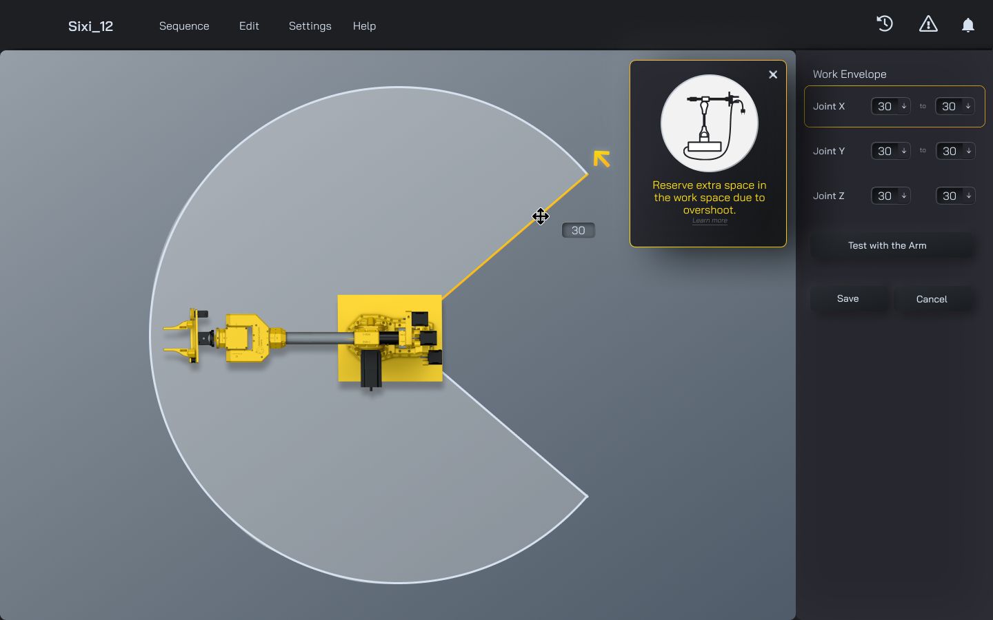
Another important heuristic is preventing users from making mistakes. The application incorporates robot movement limits and does not allow the user to drive the robot beyond the possible positions.
Besides, we designed and tested a simple settings function to define the working envelope. This will allow the user to restrict the arm’s movement according to the space limitations.
User Testing
This project included three rounds of user testing. Each testing session included 5-6 users and had different goals. Due to COVID-19, all the tests were conducted remotely by using the clickable prototype or the application MVP. In addition, the team conducted an acceptance test to evaluate the web application prototype in webGL.
Overall, users provided very positive feedback.
- Users enjoyed exploring the application
- The learning curve was very short
- We have validated that the main functionality that the hobbyist users want to see in the application is included in the current iteration
- UI design played an important role in providing visual clues and supporting intuitive of the user experience
- Both inverse and forward kinematic control was intuitive to all users and they didn’t request further instructions
- All the users fully completed the test tasks
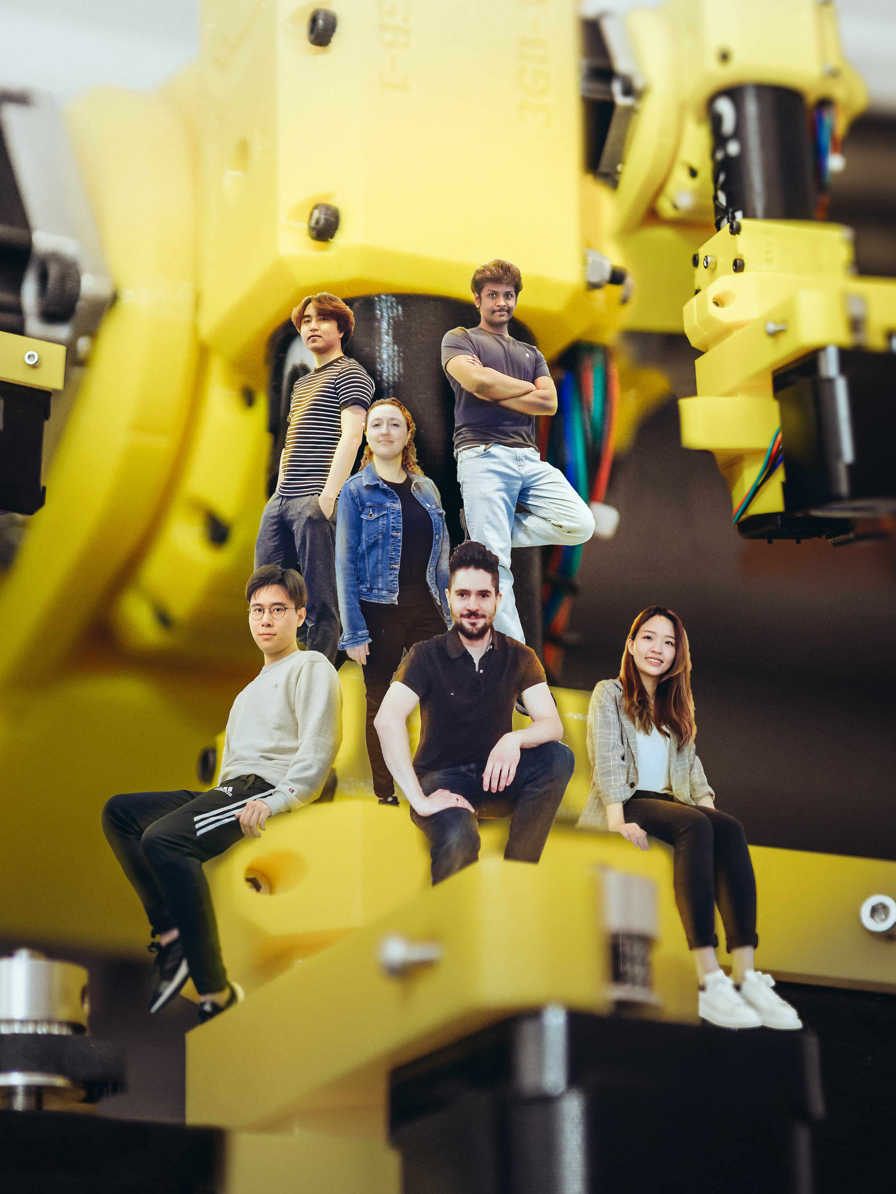
Credits
- Andre Wang Animation and 3D art
- Bigger Yang Technical art
- Eugene Chau UX research and PM
- Tyler Steele Development
- Ghanashyam Sateesh Development
- Lena Atzaba UX & UI design
