Knowledge empowering legal chat-bot
Brief
Problem
Small non-profit organizations are chronically short on time and resources – which makes finding time to review legal compliance challenging. Due to the lack of accessible resources to view general compliance rules in one location, many of these organizations do not realize they are missing critical information.
Without knowing their compliance blind spots, non-profit organizations could
be putting themselves at risk.
Client
Pacific Legal Education and Outreach (PLEO) Society is a BC based non profit that provides accessible legal support for non profit organizations.
Constraints
- 3 months proof of concept (POC) project.
- Provincial COVID-19 protocols and regulations, the project was completed remotely.
- User tests were conducted remotely.
My Role | UX & UI design
What I actually did:
- UX research
- Facilitated user interviews
- Conducted user tests
- Facilitated design sprints for the team
- Created interactive low and high fidelity prototypes
- Full UI design and illustrations
- Full product process from research through to shipping
- Documentation
- Created the team’s blog
Solution
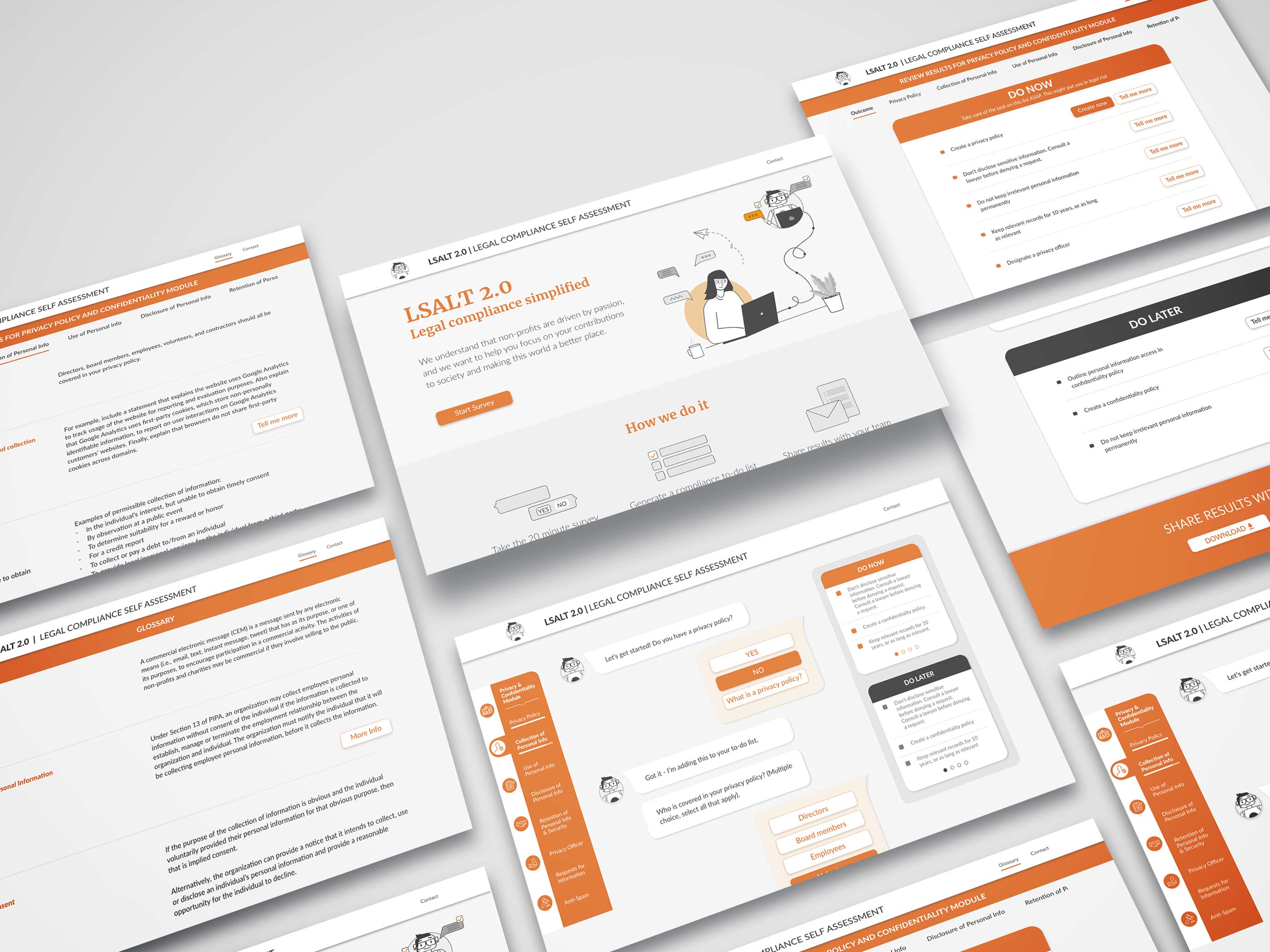
An engaging, web-based legal compliance self-assessment that empowers non-profits to assess risk, address vulnerable areas, and easily share findings.
Checkout the first module, now available on PLEO’s website.
Scope and constraints
Research
1. Analysis of the domain.
LSALT 1.0
Based on the first iteration of the tool, which was just a simple SurveyMonkey questionnaire, the guiding goal for this iteration was to create an assessment that is quick, engaging, and personalized.
Competitive landscape
Types of currently available online legal information:
Legal education and resource sites
Often dense, text-heavy, and fragmented.
Multimedia lectures
Time-consuming, not always relevant, doesn’t always include take-home resources to review.
Online communities and forums
Hard to verify credibility or access the resources needed to answer specific questions.
2. User interviews
The team conducted 1:1 interviews with five non-profit users and legal advisors that have experience in the non-profit sector. While we would have preferred to meet with more direct users, we were pressed for time and were struggling to receive responses from enough local arts non-profits. Therefore we opted to include subject matter experts who work closely with this demographic to provide insights into the problem.
Key findings:
Everyone trusts people more than the internet
Be positive & compassionate
Results need to be prioritized
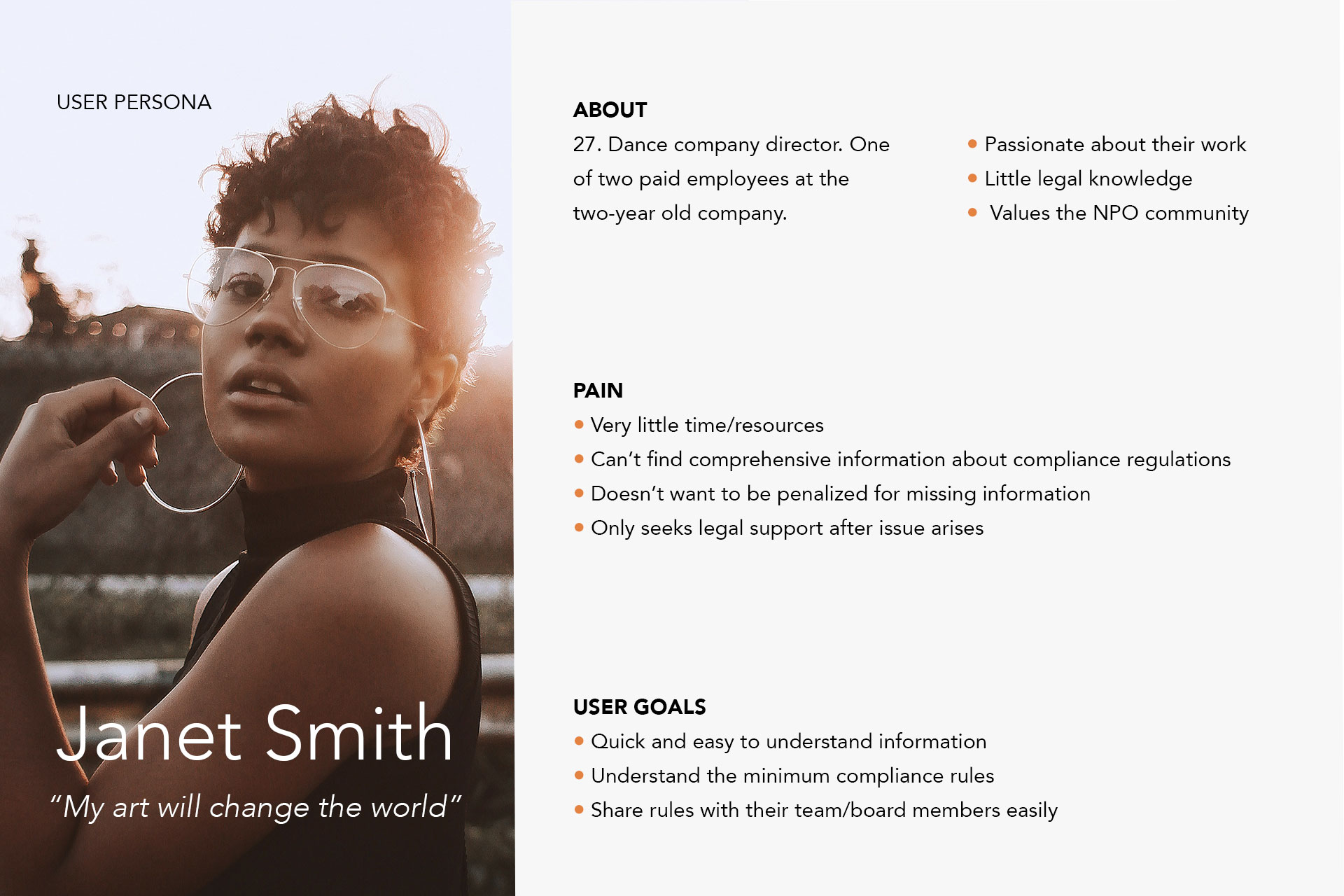
User persona
Design Sprint
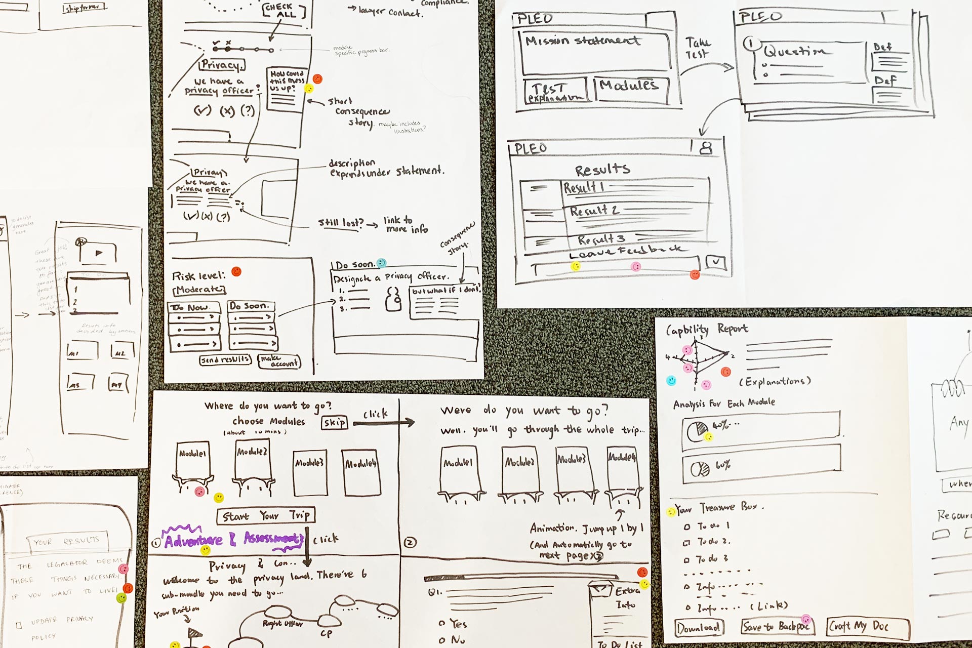
To expand our idea generation and create a full sketched prototype, I’ve facilitated the Design Sprint workshop for the team, which provided grounds for our first design iteration. In the week-long in-person sprint fully participated 3 developers, a marketing specialist and a project manager. During the workshop week, the team created two main concepts for possible solutions: Interactive Wizard Survey and Chat-bot experience.
I have designed low-fidelity interactive prototypes for the Chat-bot Self-Assessment and the Interactive Wizard. Both solutions were a/b tested with groups of 5 users. Based on the user's reaction during the test and follow-up interviews, we concluded that the users preferred the Chat-bot prototype.
Content Structure and Emotional design
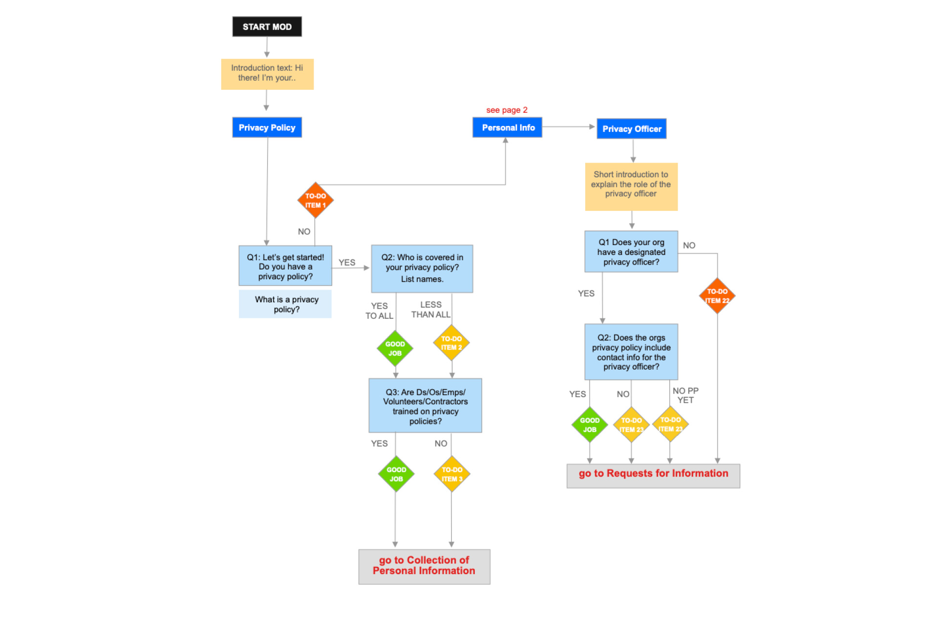
We designed for empathy built upon the flowcharts we got from the client expanded into a full module script. The script included introduction statements, single choice questions, multiple-choice questions, various responses, to-do list items, and supporting information repeated on the results page.
Humans are used to contextual communication. We are innately wired to have conversations. It’s subconscious behaviour that we want to embrace in our tool. We are not trying to create an illusion of conversation with human and overpromise. We are transparent with the users that the experience they are going through is an interactive survey that has been designed conversationally.
Despite all that, bot’s personality is is our primary focus
We wrote a script for empathy and tried to humanize our chat experience.
Since we are designing semi-conversational UI and we aren’t going to implement native language processing in the timeline given for this project, we had to define both sides of the conversation: the user and the bot.
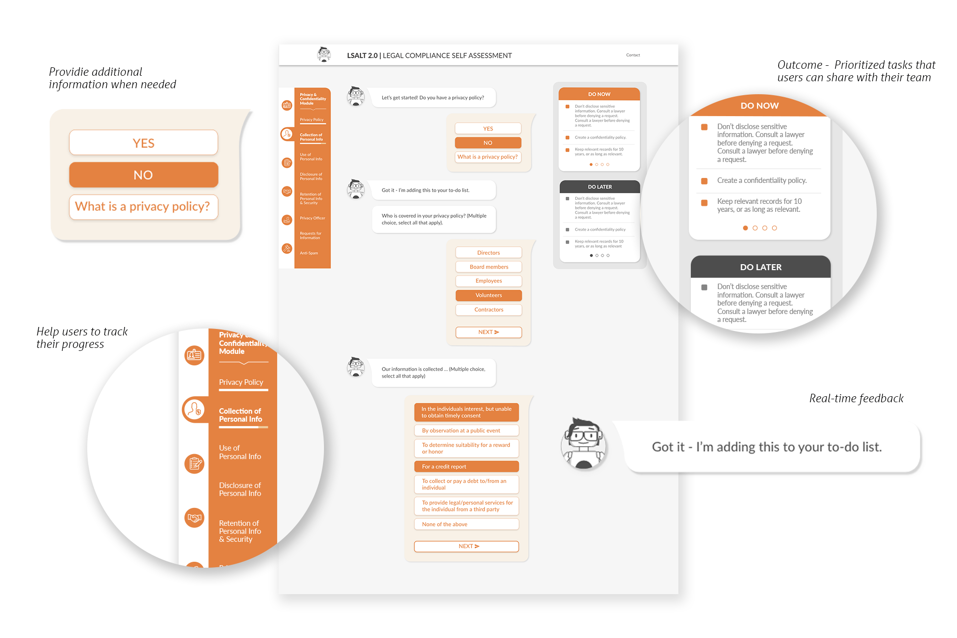
The users’ script seems to be a natural part. As the goal is to make the experience simple, quick, and effortless in a project timeline, the user should choose from “Yes” or “No” answers. The only additional thing they might use in the response is asking for term clarification. Clarifying the request of the legal term would appear as one of the users’ answers if the question above included complicated legal terminology. The language was simplified so that none of the items would include more than one legal term.
What about the bot? How do we define its personality? Is it a friendly peer or a super professional lawyer? Is it focused on advancing the conversation, or does it stop to provide feedback?
You can read more about the empathy considerations in the blog posts I wrote during the project.
While testing the personality approach to the script, we asked the users how they imagined the character they were interacting with. Most of the users found the voice read by the personality with a sex opposite to their own to be more intuitive or efficient. A majority of users pictured themselves chatting with a personality wearing a formal outfit.
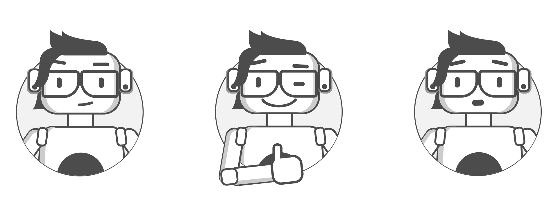
After several iterations, I designed a gender-neutral version – Lia which was used in the final prototype.
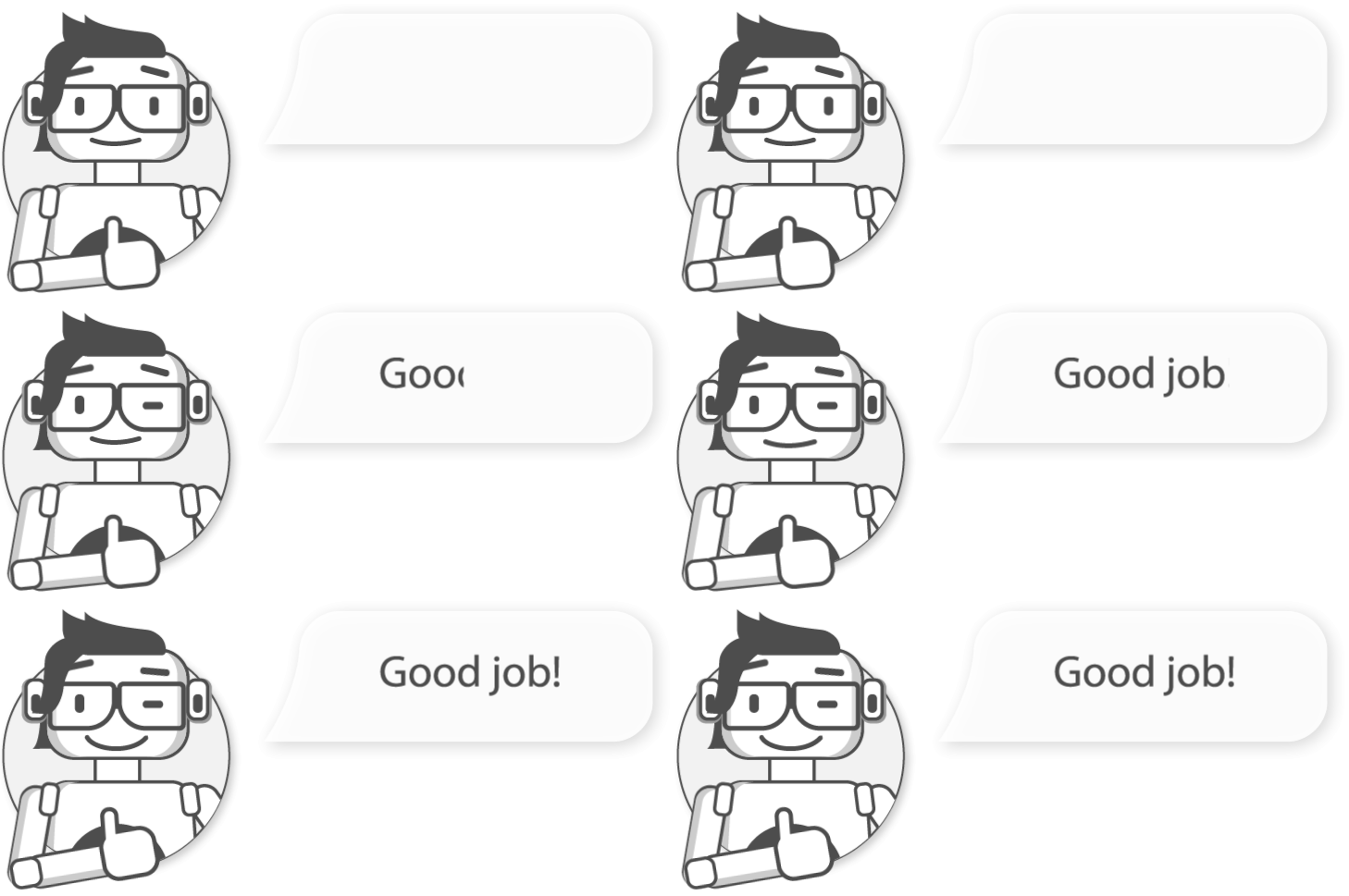
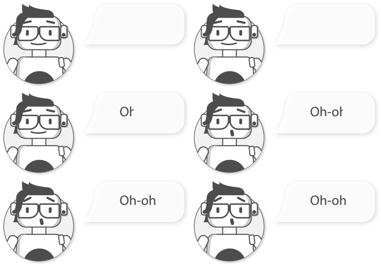
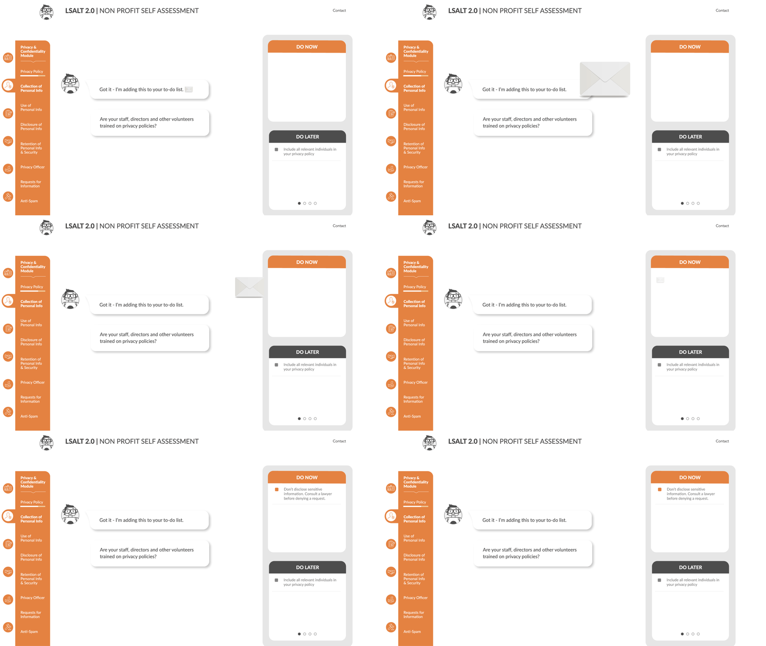
We developed simple animated reactions to implement in the future for quick, non-verbal animated feedback and to replace some of the verbal feedback currently used in the script. We assume that this will make the tool more engaging and shorten the experience.
Final Product
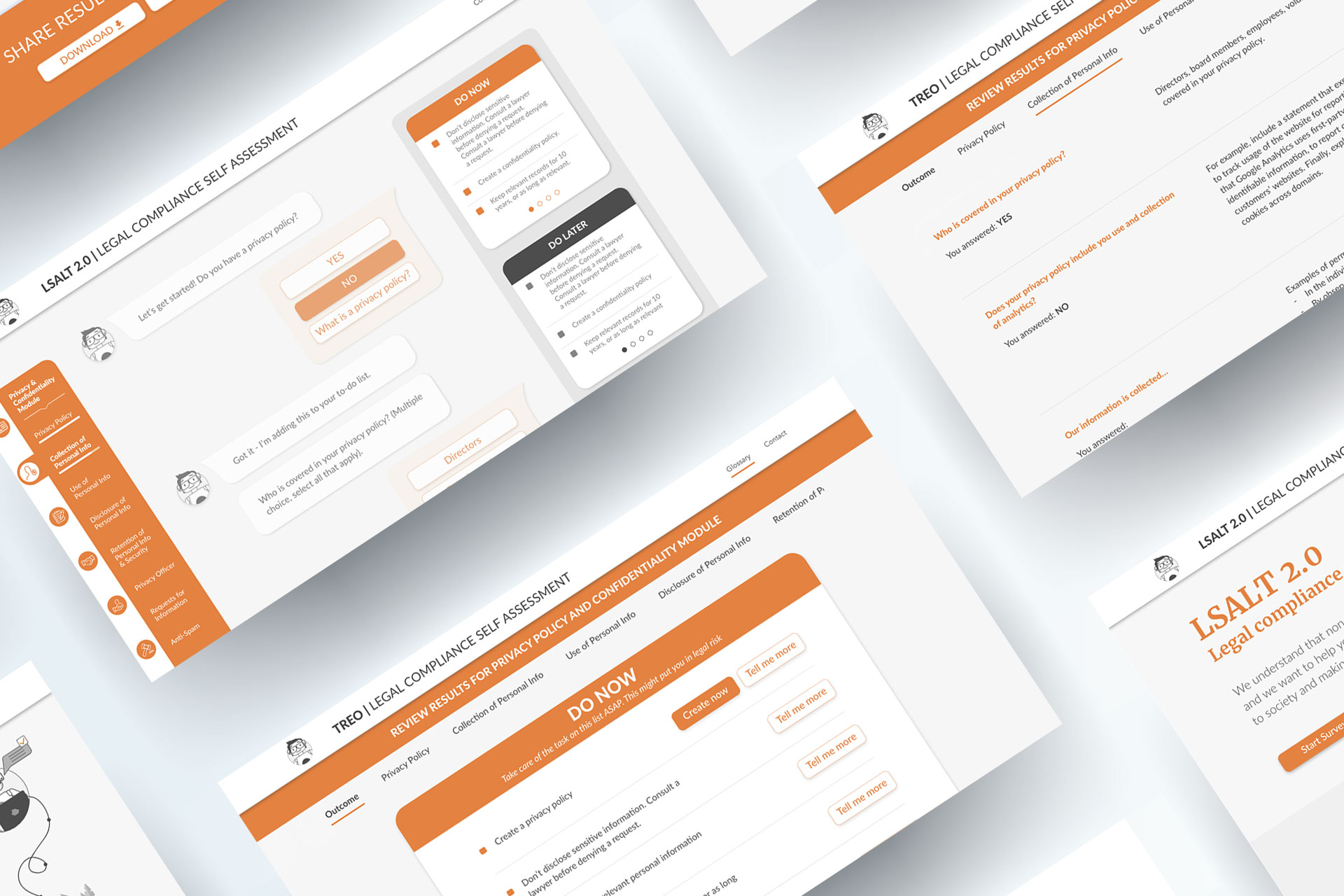
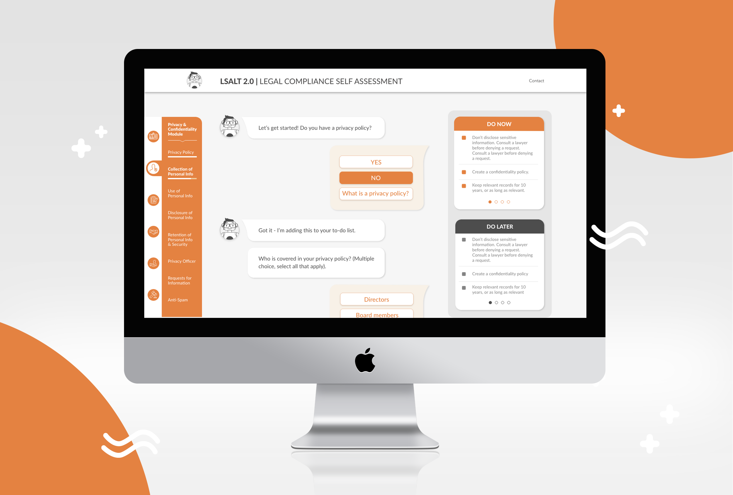
By providing pre-determined extra information content, the user can select how much information they are given before answering the question. This reduces the amount of text content required and gives less experienced users the opportunity to gather more information. The content was purposely short to only provide the information required to answer the question. When multiple concepts need to be described to answer the question, we included this content as an Introduction Statement before the question appears.
We included a scroll animation to help the user understand the navigation through the chat messages. This also provides pacing for the survey to keep a moderate speed while avoiding overwhelming the user.
Future iterations could include:
▪ Animating the characters reactions to the users’ input
▪ Including stickers and icons as a reaction. This could include an icon or animation to show that an item was added to the list
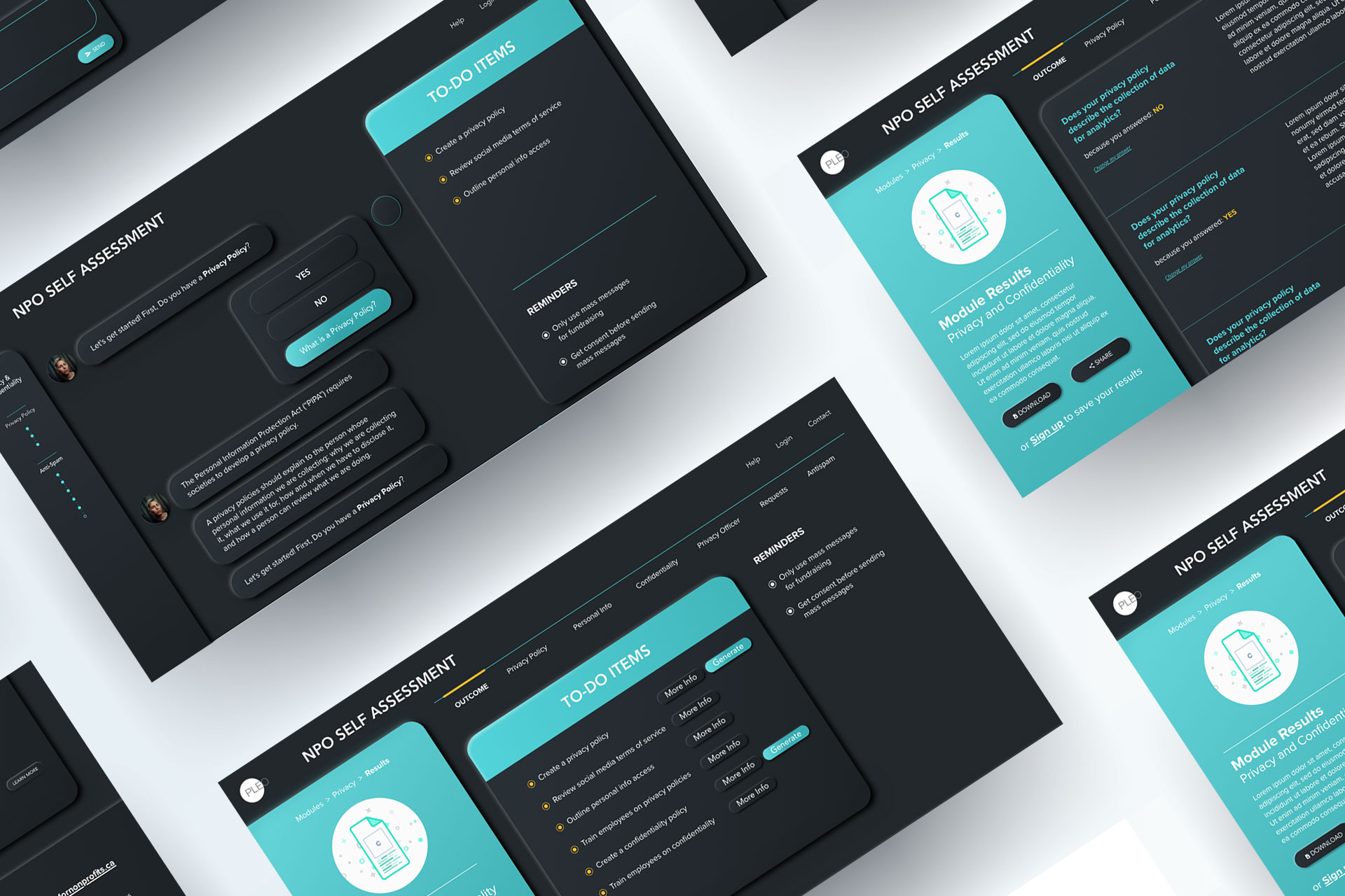
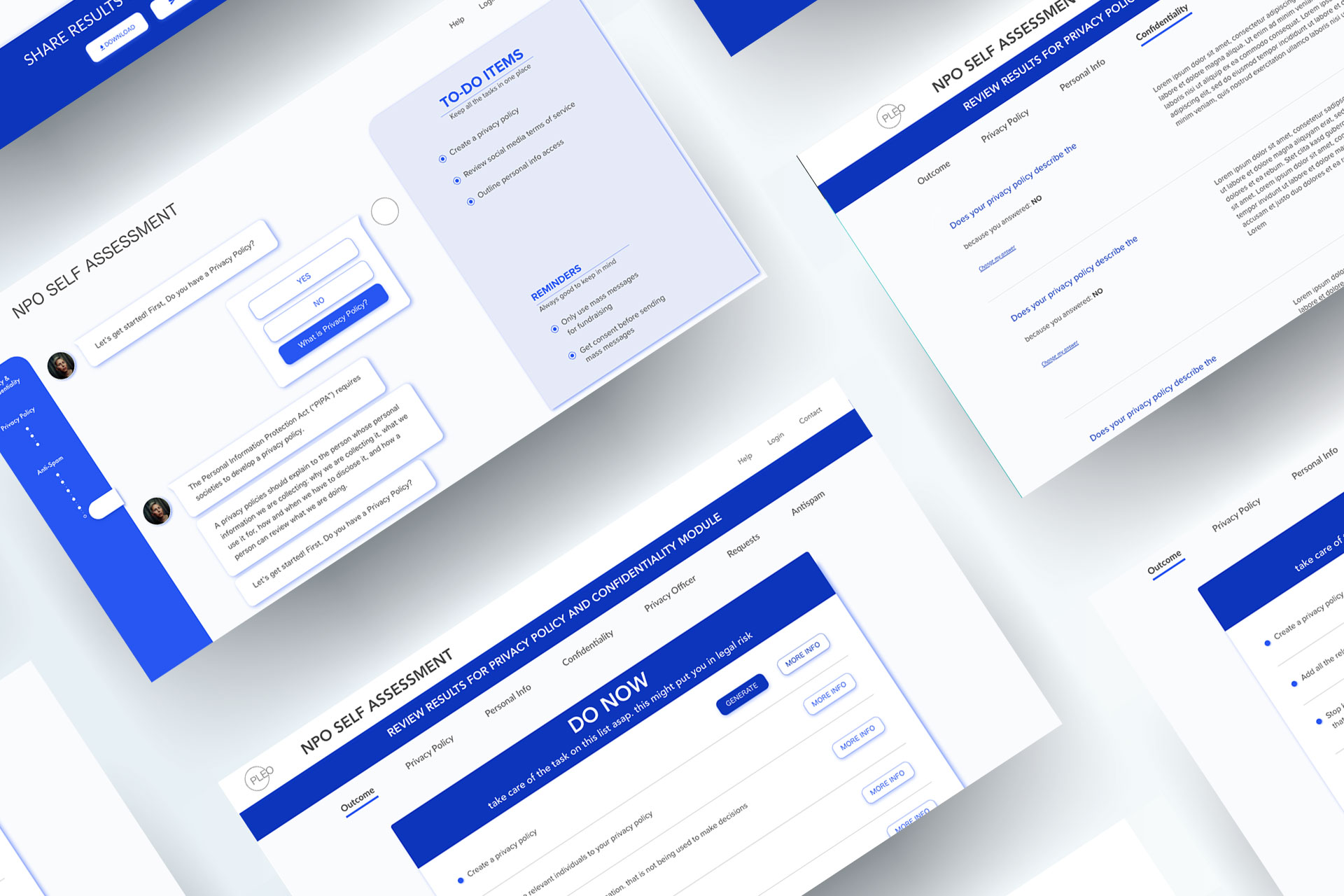
To-do items are a feature that allows the user to take away actionable items from the self assessment based on their answers. While we recognize it is difficult to retain large amounts of new information while going through an assessment, this feature helps users remember key information and feel confident that they are not missing important learnings from the assessment. To-do items generate on the go, giving users instant feedback about their answers, and once the assessment is complete, users can save and review these items for future reference.
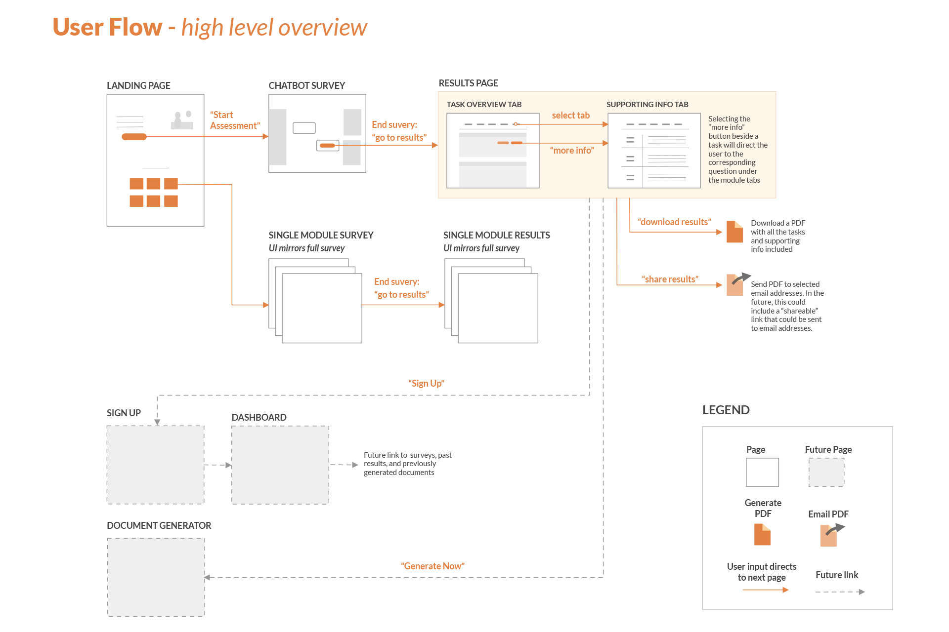
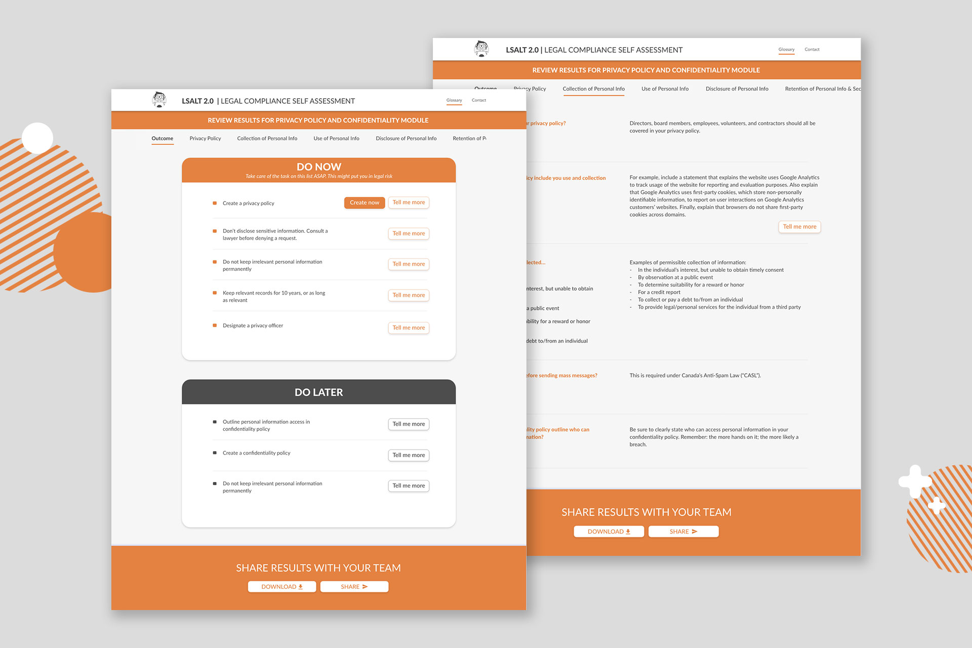
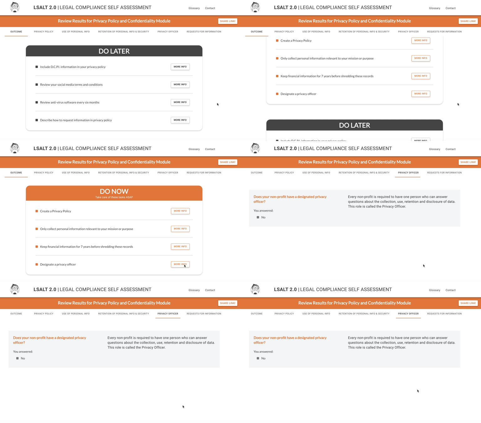
The results page allows the user to toggle between the consolidated list of To-Do Items or to review extra information about specific questions under each module. This page also indicates the answer that the user selected during the self assessment.
When selecting the “More Info” buttons beside the To-Do Items, the user is directed to the question that corresponds with that item. The extra content stated here aims to help users complete their To-Do Items. For example, if the item asks the user to add a statement to their Privacy Policy, sample text could be included with the corresponding question.
Final User Testing Outcomes
A final usability test was conducted remotely due to COVID-19.
All participants navigated the landing page and self assessment successfully and intuitively. All participants understood the function of the To-Do list, and multiple users described the user experience as “foolproof” or “easy to understand”.
100%
Are likely to take the full assessment
83%
Reported an increase of knowledge of Privacy
100%
Are likely to recommend the tool to other organizations
Future iterations
This project is a successful POC of the self-assessment tool.
Next, the full content will be developed, this conversational experience will become a part of Legal Portal for Arts non-profit organizations.
Credits
- Angela Hamilton – Project Supervisor
- Lena Atzaba – UX & UI Design
- Summer Hussain – Co-PM, Marketing
- Ye Lan – Developer
- Anastasiya Sokha – Developer
- Yi Bie – Animator, Developer
- Courtney Clarkson – Co-PM, UX Research, Information Design
“Big thanks to PLEO for their help and support throughout this project!
And special thanks to the Centre for Digital Media for their ongoing support and resources.”
